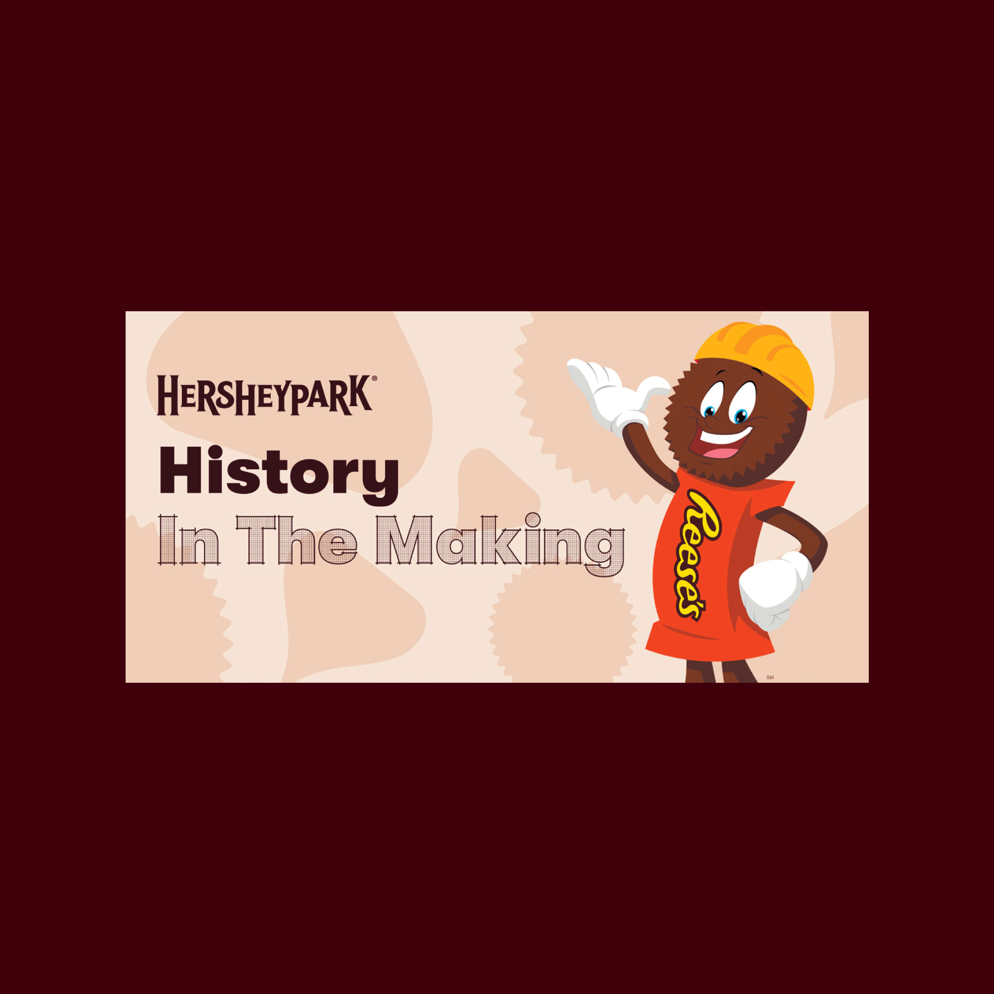
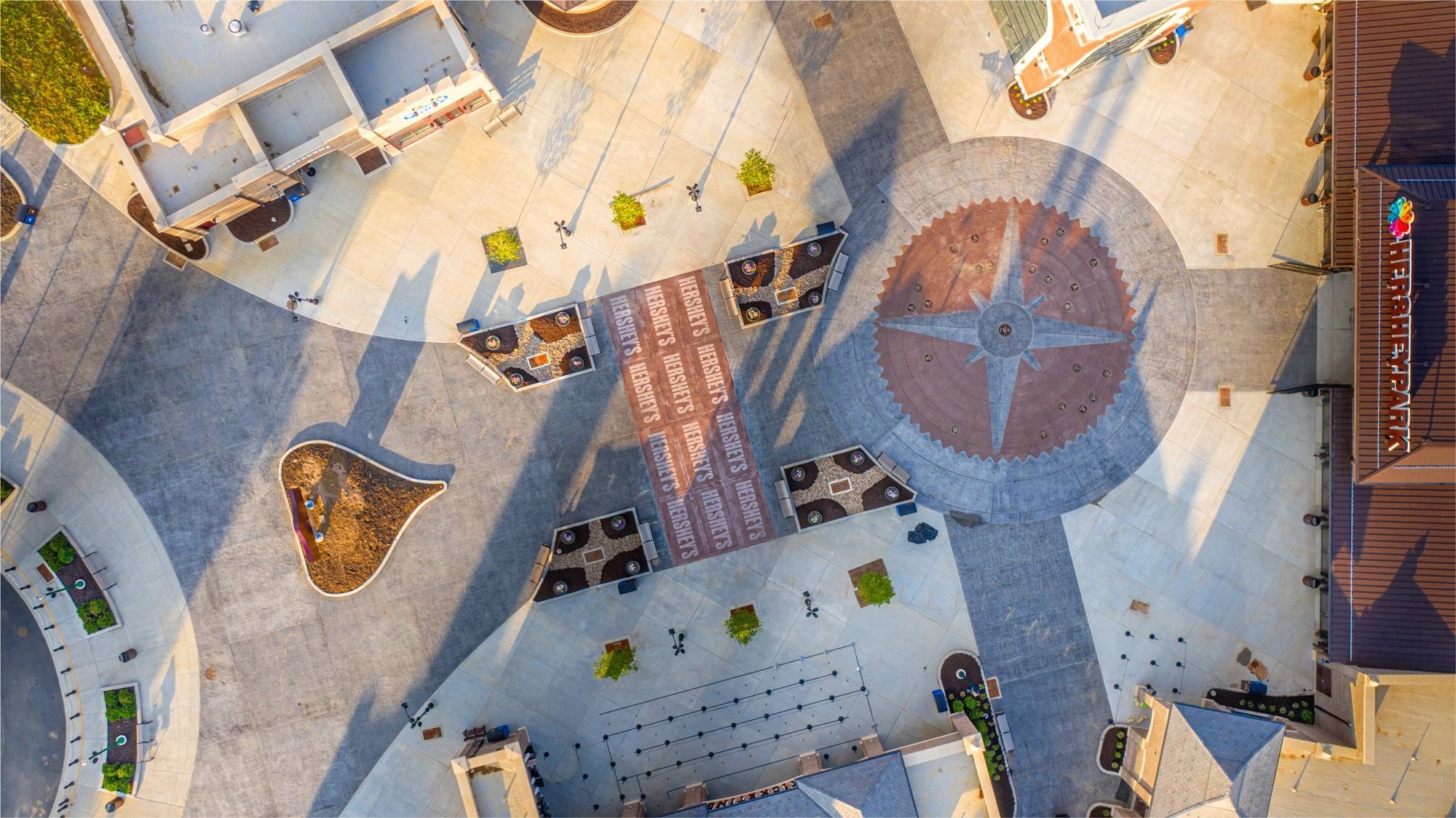
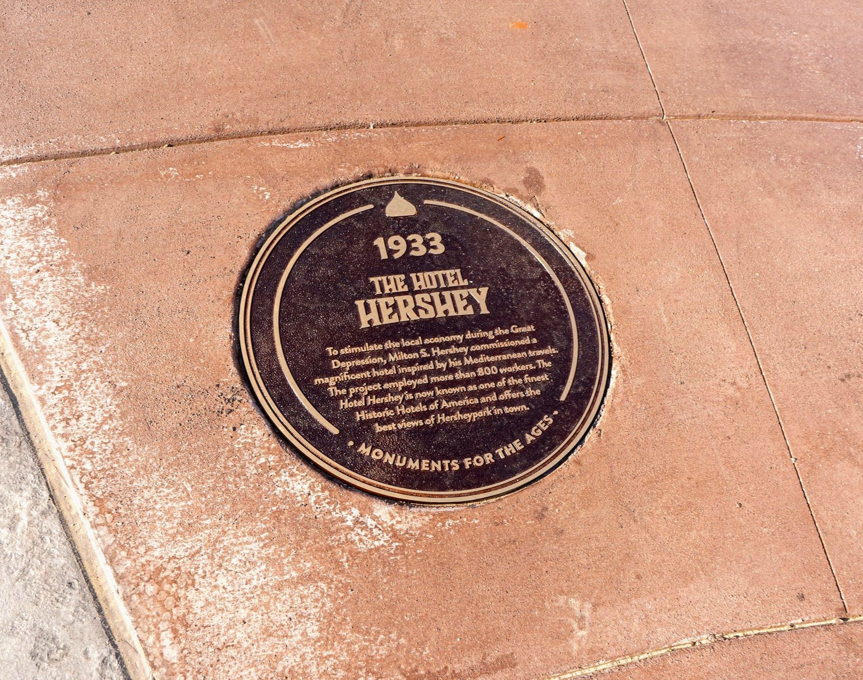
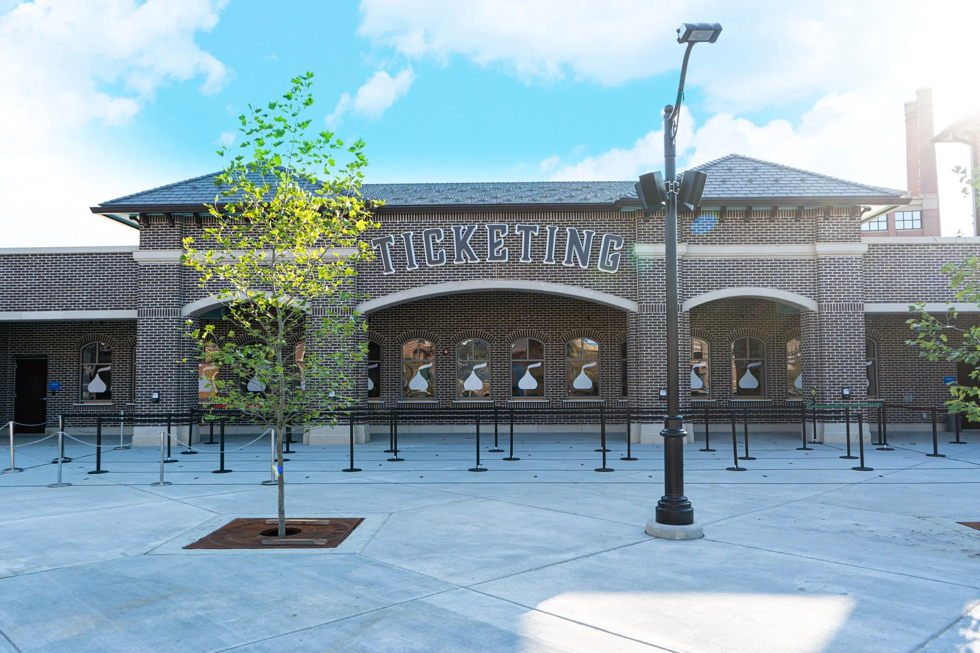
Hershey’s Chocolatetown
Brand Design
Art Direction
Motion Design
Environmental Design
Video Production
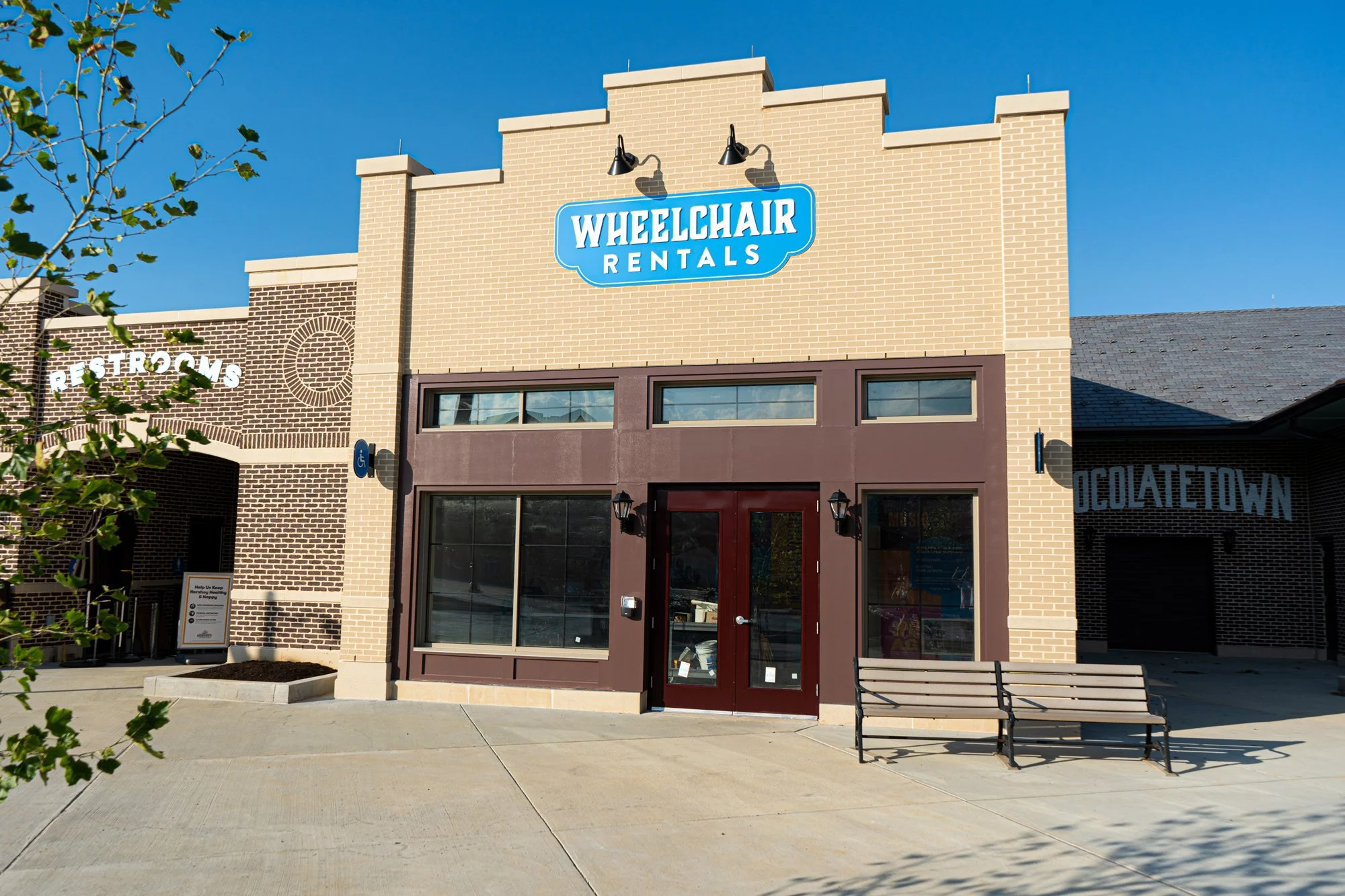
Drawing inspiration from chocolate and Milton Hershey's legacy, this brand identity for Hersheypark's Chocolatetown expansion captures early 20th-century warmth and nostalgia. The multi-year project encompassed logo design, promotional campaigns, retail branding, architectural wayfinding, and interior graphics throughout the 23-acre development.